Corn Syrup and Rats

Steve Kamb at Nerdfitness posted a link on Facebook about a study that supposedly proves that high-fructose corn syrup makes you fat. I've always been pretty dubious about the bad rap that HFCS gets, and Archer-Daniels-Midland didn't even pay to have me say that. I'm not saying no mind you. Anyhow, I was roused to action, so I went and got the paper so I could read it for myself. I found it, interesting. More about that in a moment. First I want to talk about the press release.

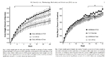
Staged Lab PhotoI really liked the picture that went with the article. You should click on the picture for the full version. It is very clearly staged, but I'm not blaming the PI or his students for that. Science is tedium occasionally punctuated by excitement that turns out to be either a complete failure or the best thing that ever happened. This makes for bad photos.
The Magistra has modeled for science lab photos several times for NAU, so I have an inside scoop on what you do during photo ops. What is done has no relation to what actually goes on in the lab, but it looks much better on glossy paper. The number one thing the photographers insist on is colored liquids, when almost everything you ever use in a lab is clear. There is a lot of standing about trying to look busy or transferring liquids in improbable fashions.
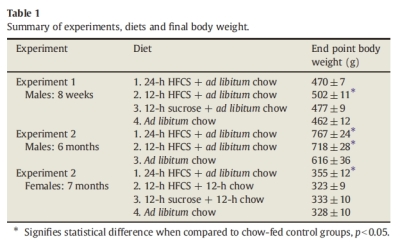
On to the study itself. I don't really think this is a masterpiece of science. The sample sizes were small, the DOE was unbalanced, and the graphs blow. I copied the results table to share with those of you who can't easily access journals. This nicely illustrates my complaint about the design of this experiment. The three experiments all have different sets of conditions, and a bad side effect of this is the sample size is really small for each grouping. If they had consolidated into fewer conditions, the sample size would have been much better [20 instead of 10 for Experiment 1 with just 24 hour corn syrup and controls].
Here are the main graphs from the article. I suppose the graphs really are not that bad, but if you look at the legend, you see that the graph shows "means±SEM". SEM, WTF is that? I guessed it meant standard error of the mean, but I'm used to seeing that called SE or SE(x). That is one of the perils of statistics, that there is no real standard symbology or nomenclature. But, I still thought it odd to graph that, so I did a Google search, and the first result confirmed my suspicions.
The problem here is that we understate the variability by using the standard error of the mean, which is really nothing but the standard deviation divided by the square root of the sample size. You would think I would be for this, because it punishes you for small sample sizes, but really I care more about individuals than means in most cases. Think of it this way, if I gave you one of these fat rats, could you tell me which group it came from by weight alone?
Here is a graph to illustrate what I mean. I took the end point body weight data from Experiment 1 and created distributions. I assumed a normal distribution, which is really not a bad assumption for weights, and I graphed them by the stated mean and calculating the standard deviation from the standard error of the mean. Red is the 24 hour corn syrup group, blue the 12 hour corn syrup group, green the sucrose group, and black the control group.
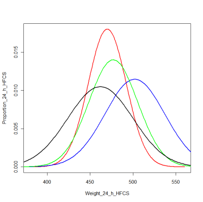
For all but the 12 hour corn syrup group, you probably couldn't tell a random rat apart. Even with the 12 hour group, you have only about a 50-50 chance of getting it right, unless the rat is really, really fat. This is what I mean by understating the variability. If we saw a graph of the raw data, I bet we would see a whole lot of nothing. Unfortunately, scientific protocol does not usually offer us the raw data.
I think this is bullshit. These protocols are from an age when data was hard to come by. It is no longer. I provide the raw data with every technical report I file, so I feel that this is not unreasonable for scientists to do either. I usually have more data points too. The 96 data points this study depends on would not break the server the journal is hosted on. Since we have no raw data in the journal article, I decided to simulate it. I did four simulation runs and printed the results. The simulation data is 10 points drawn from the distributions graphed above for each group, and then the groups are compared by an ANOVA as stated in the paper.
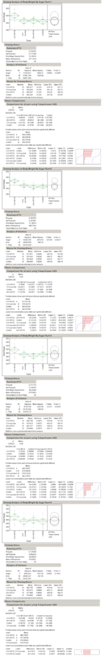
They do pretty well in the ANOVA. A real simulation would need at least 1000 runs, but I'm busy, so here are four. In three of the four we get the same significance results. This is good. However, they do less well in the pair-wise comparisons, which are really more important here. Only one out of four showed clear groupings, the reason being the sample sizes were too small for this kind of comparison.
Really, the authors just tried to do too much with too little. But, I suppose that is the real story here. Even though this was funded by taxpayers [me], there wasn't enough money for enough rats to do a good job. Now, I know good and well that animal research is surprisingly expensive, but what is going on here is this research is just not important enough to justify doing it right, which tells you all you need to know.

Comments ()