College Learning Assessment Plus
The Wall Street Journal has an article up on the CLA+ test, with an accompanying data set from 68 public colleges obtained through FOIA requests. I put all the data in an EXCEL style spreadsheet as well.
I always like to plot my data, so here is a scatterplot matrix of the whole thing:
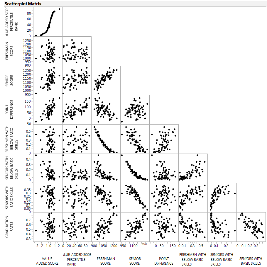
CLA+ Scatterplot Matrix
There are several columns that are just different ways of saying the same thing, like Freshman Score and Freshmen with Below Basic Skills. So I dropped everything that was just the same data in a different format and we get this:
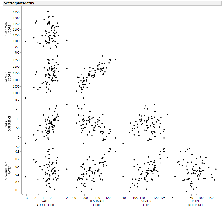
Subset of CLA+ Scatterplot Matrix
Just about the only scatterplot that stands out to me is that higher freshman scores are pretty correlated with higher senior scores. I never would have guessed.
The next most interesting is the relationship between freshman score and the difference between freshmen and senior scores. The correlation is negative, perhaps implying there is a score ceiling in the test, or that average college graduates tend to end up in about the same place by the end of school.
Both freshman scores and senior scores are correlated with graduation rates, but since we are supposed to be using this data to see whether a given college does anything useful, I plotted both freshman and senior scores against graduation rates, but I color-coded the points by the improvement between freshmen and senior scores.
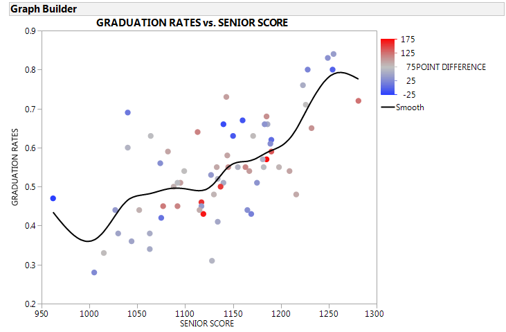
CLA+ relationship between senior score and graduation rates, color coded by score improvement
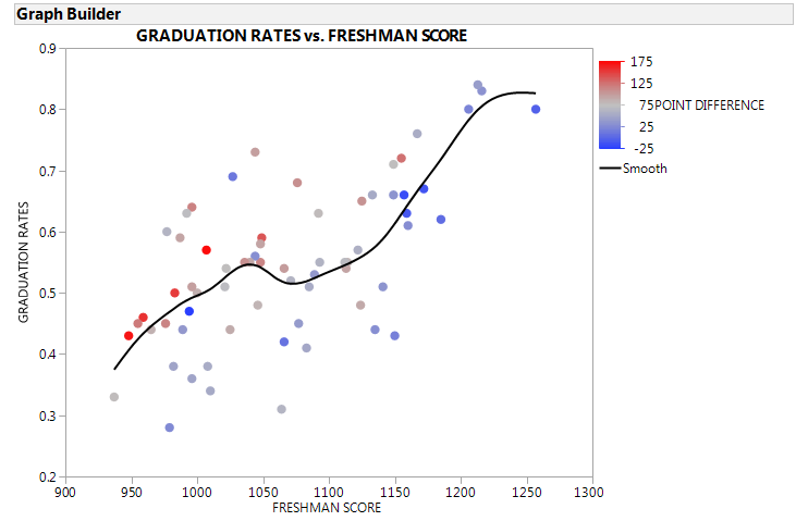
CLA+ relationship between freshman score and graduation rates, color coded by score improvement
The color-coding looks random on the senior scores graph, but against freshman scores the highest improvements are concentrated at the lower-left. This might be interesting, since point difference versus graduation rates in general looks pretty random in the first scatterplot matrix.
I don't see anything groundbreaking here, which is probably why colleges don't talk about this much. If there was something to crow about, they would.


Comments ()