How Salary Data Should Be Reported
Another interesting thread in the PhysicsForums. This one was a question about the salaries earned by PhD physicists. The poster seemed to be from Central Europe, the Czech Republic perhaps, and wanted to know whether physicists actually earned $90k on average.
The consensus was yes, this information is basically accurate across all people in the US with physics PhDs, but you have to keep in mind experience, and location, and other mitigating factors. What is really interesting from the thread is a graph posted to show what a bimodal salary distribution looks like.

Distribution of Lawyer Salaries
From Payscale of course, this graph shows that lawyers fall into two groups for starting salaries, those who get a job at a big law firm, and everyone else. The folks in the hump on the right are getting paid about 3 times more than the folks on the left.
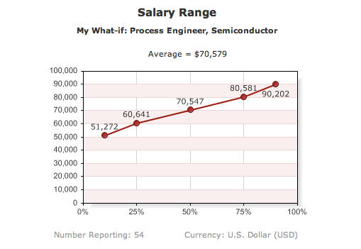
I wish all salary data was reported this way. Part of the reason it is not is most salary distributions have that bell-shaped curve, so we can describe them fairly well using just averages and standard deviations, or percentiles. But the distribution is just a much better way to communicate this kind of thing. Even Payscale normally does these percentile plots that are really less informative.

I suppose in their defense the n is only 54 on that plot, but still! There are better ways to do these things.

Comments ()