Marriage and Divorce in the United States: A Trend
I’ve been meaning to start up a new series of posts that is mostly data-driven, showcasing some interesting bit of information that I’ve come across. Finding a really interesting chart, and then tracking down the data behind it is as good an excuse as any.
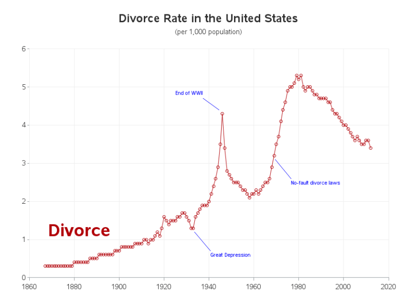
Courtesy of H.P. at Hillbilly Highways, I found this dataset on marriage and divorce in the United States compiled by Robert Allison at the SAS Blog. Robert has some notes on where he got it from, mostly the CDC, plus some other miscellaneous sources.
The feature of the divorce “rate” that fascinates me is that it looks very much like there is an underlying trend over time that is temporarily disturbed by things that happen in the world. Robert annotated his chart with some helpful labels that seem pretty reasonable to me.
In order to illustrate the trend, I excluded a few years that look like excursions above trend, and then I fit a simple y = ax + b style model. I’m not really interested in the functional form per se, or a detailed analysis of the years I chose. There are tools for that, but I mostly want to do a visual analysis. However, I will note that the years I picked visually ended up being 1940 - 1955, and 1968 - 2003, which match up pretty well as periods in American life when unusual things were going on in marriage and divorce. I think the charts speak to that.
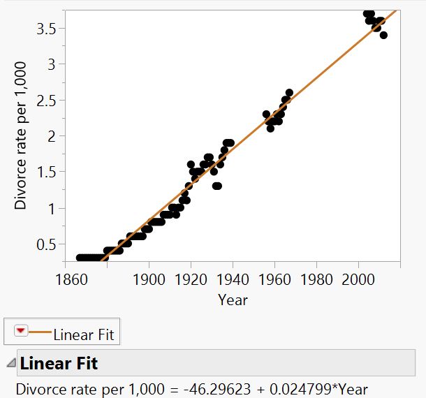
US Divorce Rate with points above trend hidden for illustration
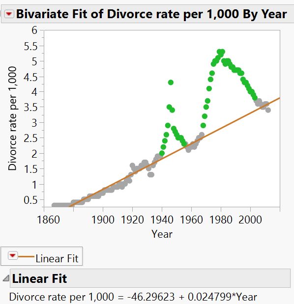
The same chart with the hidden values added back in
The years I picked really do seem like they represented a big surge of divorces, with an almost equally rapid return to trend. The 1968 bump lasted longer, even though the peak magnitude of the disturbance is almost equal to what happened at the end of World War 2.
Now let us look at the other things Robert charted, marriages per year and the ratio of marriages to divorces.
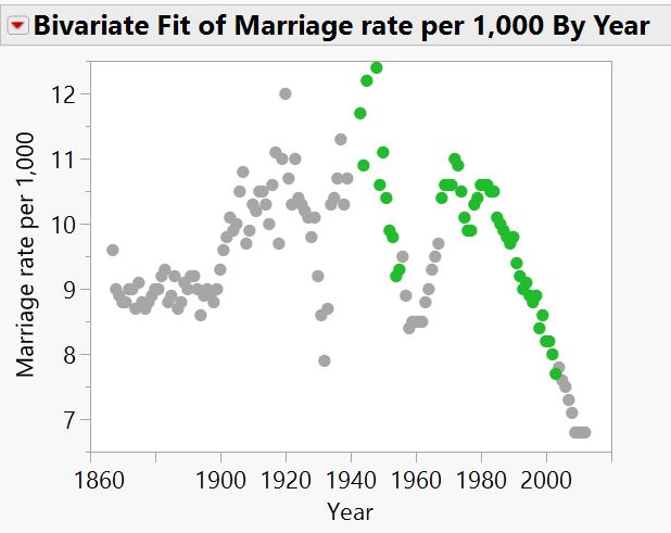
Marriages per year, with my unusual years for divorces highlighted in green
Marriages don’t display a clear trend, but there is a lot of variability over the twentieth century. The long term mean of the twentieth century is higher than the nineteenth as well, which matches up with some things John J. Reilly said in his review of Gertrude Himmelfarb’s The Demoralization of Society. There was a long term project to ameliorate the plight of the common man by shoring up family life, and that effort peaked in the mid-twentieth century. I don’t have comparative data for England, but this would make for a good follow-up post.
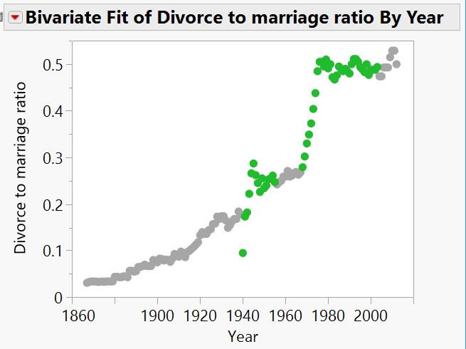
Divorces per year divided by marriages per year, with my unusual years for divorce highlighted in green.
The ratio of divorces to marriages shows the long upward trend that is present in the divorce rates, at least until 1976 or so, when it flattens off to where we find it today. It will be interesting to see if the recent downward trend continues, or we return to the long upward trend of the past 150 years.
Comments ()